styled()
Utility for creating styled components.
Introduction
All the MUI components are styled with this styled() utility.
This utility is built on top of the styled() module of @mui/styled-engine and provides additional features.
Import path
You can use the utility coming from the @mui/system package, or if you are using @mui/material, you can import it from @mui/material/styles.
The difference is in the default theme that is used (if no theme is available in the React context).
What problems does it solve?
The utility can be used as a replacement for emotion's or styled-components' styled() utility. It aims to solve the same problem, but also provides the following benefits:
- It uses MUI's default
themeif no theme is available in React context. - It supports the theme's
styleOverridesandvariantsto be applied, based on thenameapplied in the options (can be skipped). - It adds support for the the
sxprop (can be skipped). - It adds by default
shouldForwardPropoption that is taking into account all props used internally in the MUI components (can be overridden).
API
styled(Component, [options])(styles) => Component
Arguments
Component: The component that will be wrapped.options(object [optional]):options.shouldForwardProp((prop: string) => bool[optional]): Indicates whether thepropshould be forwarded to theComponent.options.label(string [optional]): The suffix of the style sheet. Useful for debugging.options.name(string [optional]): The key used undertheme.componentsfor specifyingstyleOverridesandvariants. Also used for generating thelabel.options.slot(string [optional]): IfRoot, it automatically applies the theme'sstyleOverrides&variants.options.overridesResolver((props: object, styles: Record<string, styles>) => styles [optional]): Function that returns styles based on the props and thetheme.components[name].styleOverridesobject.options.skipVariantsResolver(bool): Disables the automatic resolver for thetheme.components[name].variants.options.skipSx(bool [optional]): Disables thesxprop on the component.- The other keys are forwarded to the
optionsargument of emotion'sstyled([Component], [options]).
Returns
Component: The new component created.
Basic usage
import * as React from 'react';
import { styled } from '@mui/system';

const MyComponent = styled('div')({
  color: 'darkslategray',
  backgroundColor: 'aliceblue',
  padding: 8,
  borderRadius: 4,
});

export default function BasicUsage() {
  return <MyComponent>Styled div</MyComponent>;
}import * as React from 'react';
import { styled, createTheme, ThemeProvider } from '@mui/system';
const customTheme = createTheme({
palette: {
primary: {
main: '#1976d2',
contrastText: 'white',
},
},
});
const MyThemeComponent = styled('div')(({ theme }) => ({
color: theme.palette.primary.contrastText,
backgroundColor: theme.palette.primary.main,
padding: theme.spacing(1),
borderRadius: theme.shape.borderRadius,
}));
export default function ThemeUsage() {
return (
<ThemeProvider theme={customTheme}>
<MyThemeComponent>Styled div with theme</MyThemeComponent>
</ThemeProvider>
);
}Custom components
This example demonstrates how you can use the styled API to create custom components, with the same capabilities as the core components:
import * as React from 'react';
import { styled, createTheme, ThemeProvider } from '@mui/system';

const customTheme = createTheme({
  components: {
    MyThemeComponent: {
      styleOverrides: {
        root: {
          color: 'darkslategray',
        },
        primary: {
          color: 'darkblue',
        },
        secondary: {
          color: 'darkred',
          backgroundColor: 'pink',
        },
      },
      variants: [
        {
          props: { variant: 'dashed', color: 'primary' },
          style: {
            border: '1px dashed darkblue',
          },
        },
        {
          props: { variant: 'dashed', color: 'secondary' },
          style: {
            border: '1px dashed darkred',
          },
        },
      ],
    },
  },
});

const MyThemeComponent = styled('div', {
  // Configure which props should be forwarded on DOM
  shouldForwardProp: (prop) =>
    prop !== 'color' && prop !== 'variant' && prop !== 'sx',
  name: 'MyThemeComponent',
  slot: 'Root',
  // We are specifying here how the styleOverrides are being applied based on props
  overridesResolver: (props, styles) => [
    styles.root,
    props.color === 'primary' && styles.primary,
    props.color === 'secondary' && styles.secondary,
  ],
})(({ theme }) => ({
  backgroundColor: 'aliceblue',
  padding: theme.spacing(1),
}));

export default function UsingOptions() {
  return (
    <ThemeProvider theme={customTheme}>
      <MyThemeComponent sx={{ m: 1 }} color="primary" variant="dashed">
        Primary
      </MyThemeComponent>
      <MyThemeComponent sx={{ m: 1 }} color="secondary">
        Secondary
      </MyThemeComponent>
    </ThemeProvider>
  );
}
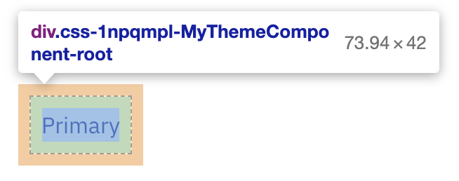
If you inspect this element with the browser DevTools in development mode, you will notice that the class of the component now ends with the MyThemeComponent-root, which comes from the name and slot options that were provided.

In addition to this, the color, sx, and variant props are not propagated to the generated div element.
Removing features
If you would like to remove some of the MUI specific features, you can do it like this:
 const StyledComponent = styled('div', {}, {
   name: 'MuiStyled',
   slot: 'Root',
-  overridesResolver: (props, styles) => styles.root, // disables theme.components[name].styleOverrides
+  skipVariantsResolver: true, // disables theme.components[name].variants
+  skipSx: true, // disables the sx prop
 });
Create custom styled() utility
If you want to have a different default theme for the styled() utility, you can create your own version of it, using the createStyled() utility.
import { createStyled, createTheme } from '@mui/system';

const defaultTheme = createTheme({
  // your custom theme values
});

const styled = createStyled({ defaultTheme });

export default styled;