components: GlobalStyles
How to customize
Você pode customizar facilmente a aparência de um componente do Material-UI.
As components can be used in different contexts, there are several approaches to customizing them. Indo da abordagem mais precisa a mais abrangente, são elas:
- One-off customization
- Reusable style overrides
- Dynamic variation
- Variação do tema global
- Sobrescrita do CSS Global
1. One-off customization
Pode ser necessário alterar o estilo de um componente em alguma implementação específica, para a qual você tem as seguintes soluções disponíveis:
Use the sx prop
The easiest way to add style overrides for a one-off situation is to use the sx prop available on all Material-UI components. Aqui está um exemplo:
<Slider
  defaultValue={30}
  sx={{
    width: 300,
    color: 'success.main',
  }}
/>
Next you'll see how you can you can use global class selectors for accessing slots inside the component. You'll also learn how to easily identify the classes which are available to you for each of the states and slots in the component.
Overriding nested component styles
You can use the browser dev tools to identify the slot for the component you want to override. It can save you a lot of time. The styles injected into the DOM by Material-UI rely on class names that follow a simple pattern: [hash]-Mui[Component name]-[name of the slot].
⚠️ These class names can't be used as CSS selectors because they are unstable, however, Material-UI applies global class names using a consistent convention: Mui[Component name]-[name of the slot].
Vamos voltar para a demonstração acima. How can you override the slider's thumb?
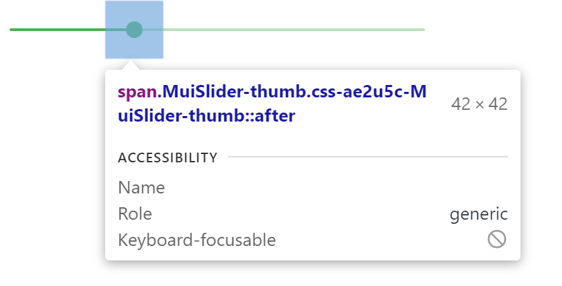
In this example, the styles are applied with .css-ae2u5c-MuiSlider-thumb so the name of the component is Slider and the name of the slot is thumb.
You now know that you need to target the . MuiSlider-thumb class name for overriding the look of the thumb:
<Slider
  defaultValue={30}
  sx={{
    width: 300,
    color: 'success.main',
    '& .MuiSlider-thumb': {
      borderRadius: '1px',
    },
  }}
/>
Sobrescrevendo estilos com nomes de classe
If you would like to override the styles of the components using classes, you can use the className prop available on each component. For overriding the styles of the different parts inside the component, you can use the global classes available for each slot, as described in the previous section.
You can find examples of this using different styles libraries in the Styles library interoperability guide.
Pseudo-classes
Os estados especiais dos componentes, como hover, focus, disabled e selected, são estilizados com uma especificidade CSS mais alta. Especificidade é um peso que é aplicado a uma determinada declaração CSS.
Para sobrescrever os estados especiais dos componentes, você precisa aumentar a especificidade. Aqui está um exemplo com o estado disable e o componente botão está usando uma pseudo-class (:disabled):
Button {
  color: black;
}

/* Increase the specificity */
. Button:disabled {
  color: white;
}
<Button disabled className="Button">
Sometimes, you can't use a pseudo-class, as the state doesn't exist in the web specification. Vamos pegar o componente menu item e o estado selected como exemplo. You can use the . Mui-selected global class name to customize the special state of the MenuItem component:
. MenuItem {
  color: black;
}

/* Increase the specificity */
. MenuItem. Mui-selected {
  color: blue;
}
<MenuItem selected className="MenuItem">
Por que preciso aumentar a especificidade para sobrescrever um estado do componente?
Por padrão, a especificação CSS faz com que as pseudo-classes aumentem a especificidade. Por padrão, a especificação CSS faz com que as pseudo-classes aumentem a especificidade. Isso tem uma vantagem importante, permitir que você escolha o estado que deseja customizar.
What custom pseudo-classes are available in Material-UI?
You can rely on the following global class names generated by Material-UI:
| State | Nome da classe global |
|---|---|
| active | .Mui-active |
| checked | . Mui-checked |
| disabled | . Mui-disabled |
| error | . Mui-error |
| focused | . Mui-focused |
| focus visible | . Mui-focusVisible |
| required | . Mui-required |
| expanded | . Mui-expanded |
| selected | . Mui-selected |
⚠️ Never style these pseudo-class class names directly:
/* ❌ NOT OK, impact all the components with unclear side-effects */
. Mui-error {
  color: red;
}

/* ✅ OK */
. MuiOutinedInput-root. Mui-error {
  color: red;
}
2. Reusable style overrides
If you find that you need the same overrides in multiple places across your application, you can use the styled() utility to create a reusable component:
import * as React from 'react';
import Slider from '@mui/material/Slider';
import { alpha, styled } from '@mui/material/styles';

const SuccessSlider = styled(Slider)(({ theme }) => ({
  width: 300,
  color: theme.palette.success.main,
  '& .MuiSlider-thumb': {
    '&:hover, &.Mui-focusVisible': {
      boxShadow: `0px 0px 0px 8px ${alpha(theme.palette.success.main, 0.16)}`,
    },
    '&.Mui-active': {
      boxShadow: `0px 0px 0px 14px ${alpha(theme.palette.success.main, 0.16)}`,
    },
  },
}));

export default function StyledCustomization() {
  return <SuccessSlider defaultValue={30} />;
}
With it, you have access to all of a component's props to dynamically style the component.
3. Dynamic variation
In the previous section, we learned how to override the style of a Material-UI component. Agora, vamos ver como podemos tornar essas sobrescritas dinâmicas. Here are four alternatives; each has its pros and cons.
CSS Dinâmico
Using the styled() utility offers a simple way for adding dynamic styles based on props.
⚠️ Note that if you are using TypeScript you will need to update the prop's types of the new component.
import * as React from 'react';
import { styled } from '@material-ui/core/styles';
import Slider, { SliderProps } from '@material-ui/core/Slider';

interface StyledSliderProps extends SliderProps {
  success?: boolean;
}

const StyledSlider = styled(Slider, {
  shouldForwardProp: (prop) => prop !== 'success',
})<StyledSliderProps>(({ success, theme }) => ({
  ...(success &&
    {
      // the overrides added when the new prop is used
    }),
}));
Variáveis CSS
<React.Fragment>
  <FormControlLabel
    control={
      <Switch
        checked={vars === successVars}
        onChange={handleChange}
        color="primary"
        value="dynamic-class-name"
      />
    }
    label="Success"
  />
  <CustomSlider style={vars} defaultValue={30} sx={{ mt: 1 }} />
</React.Fragment><React.Fragment>
<FormControlLabel
control={
<Switch
checked={success}
onChange={handleChange}
color="primary"
value="dynamic-class-name"
/>
}
label="Success"
/>
<ThemeProvider theme={theme}>
<Slider defaultValue={30} sx={{ width: 300, mt: 1 }} />
</ThemeProvider>
</React.Fragment>4. Variação do tema global
A fim de promover a consistência entre os componentes e gerenciar a aparência da interface do usuário como um todo, o Material-UI fornece um mecanismo para aplicar mudanças globais.
Please take a look at the theme's global overrides page for more details.
5. Sobrescrita do CSS Global
Components expose global class names to enable customization with CSS.
.MuiButton-root {
  font-size: 1rem;
}
You can reference the Styles library interoperability guide to find examples of this using different styles libraries or plain CSS.
If you just want to add some global baseline styles for some of the HTML elements, you can use the GlobalStyles component. Here is an example of how you can override styles for the h1 elements.
<React.Fragment>
  <GlobalStyles styles={{ h1: { color: 'grey' } }} />
  <h1>Grey h1 element</h1>
</React.Fragment>
If you are already using the CssBaseline component for setting baseline styles, you can also add these global styles as overrides for this component. Here is how you can achieve the same by using this approach.
<ThemeProvider theme={theme}>
  <CssBaseline />
  <h1>Grey h1 element</h1>
</ThemeProvider>