Card 卡片
卡片组件能够承载与单个主题相关的内容和操作。
卡片是一个显示与单个主题相关的内容和可被操作的容器。
通过卡片组件,扫描相关的和可操作的信息更为便捷了。 像文本和图像这样的元素,则应按照清晰的布局来排列,以此呈现结构层次。
Word of the Day
adjective
well meaning and kindly.
"a benevolent smile"
Word of the Day
adjective
well meaning and kindly.
"a benevolent smile"
<Card variant="outlined">{card}</Card>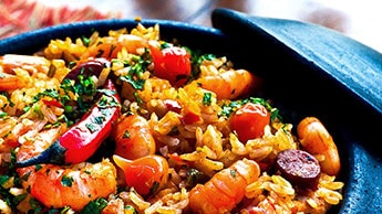
This impressive paella is a perfect party dish and a fun meal to cook together with your guests. Add 1 cup of frozen peas along with the mussels, if you like.

Lizards are a widespread group of squamate reptiles, with over 6,000 species, ranging across all continents except Antarctica
默认情况下,我们结合 <div> 元素和一张 背景图片 来展示多媒体元素。 在某些情况下它也可能会出现问题,例如,你想要显示一个视频或一张响应式的图片。 使用 component 属性可以解决这样的情况:
Lizards are a widespread group of squamate reptiles, with over 6,000 species, ranging across all continents except Antarctica
⚠️ 当
component="img"时,CardMedia 通过object-fit来居中图像。 这个用法不兼容 IE11。
主要(Primary)操作
通常情况下,卡片允许用户与它的整个表面进行交互,以触发它的主要动作,无论是扩展,链接到另一个屏幕或使用其他行为。 卡片的操作区域可以通过将其内容包裹在 CardActionArea 组件中来指定。
卡片还可以提供额外的操作功能,这些功能应该脱离主操作区域,以避免事件重叠。
Customization 个性化
🎨 如果您还在寻找灵感,您可以看看 MUI Treasury 特别定制的一些例子。