components: GlobalStyles
如何定制
您可以轻松地自定义一个 Material-UI 组件的外观。
由于组件可以在不同的环境中使用,因此有几种方法可以对其进行定制。 从最狭窄到最广泛的用例,这些是:
1. 一次性定制
您可能需要为实现特定的组件而更改样式,以下有几种解决方案:
使用 sx 属性
The easiest way to add style overrides for a one-off situation is to use the sx prop available on all Material-UI components. 下面是一个示例:
<Slider
  defaultValue={30}
  sx={{
    width: 300,
    color: 'success.main',
  }}
/>
接下来你会看到如何可以你可以使用全局类选择器来访问组件内部的插槽。 你还将学习如何轻松识别组件中每个状态和槽位的可用类。
覆盖嵌套组件样式
你可以使用浏览器开发工具来确定您要覆盖的组件的插槽。 这样做可以节省你的很多时间。 Material-UI 注入到 DOM中 的样式依赖于遵循简单模式的类名:[hash]-Mui[Component name]-[name of the slot].
⚠️ 这些类名不能用作 CSS 选择器,因为它们是不稳定的,然而,Material-UI 在应用全局类名时,使用了一致的约定:Mui[Component name]-[name of the slot].
让我们回到上面的演示。 如何覆写滑块的拇指图标?
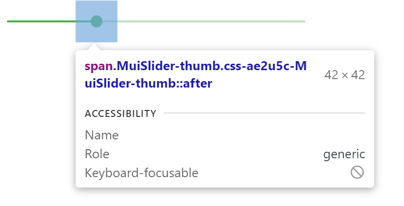
在本例中,样式应用的是 .css-ae2u5c-MuiSlider-thumb,所以组件的名称是 Slider,插槽的名称是 thumb。
你现在知道你需要针对 .MuiSlider-thumb 类名来覆盖拇指的外观:
<Slider
  defaultValue={30}
  sx={{
    width: 300,
    color: 'success.main',
    '& .MuiSlider-thumb': {
      borderRadius: '1px',
    },
  }}
/>
用类名(class names)覆盖样式
如果你想使用类覆盖组件的样式,你可以使用每个组件上可用的 className 属性。 对于覆盖组件内部不同部件的样式,可以使用每个槽位可用的全局类,如前一节所述。
您可以在 样式库互操作性 指南中找到不同样式库的示例。
CSS 伪类(Pseudo-classes)
组件会有一些特殊的状态,如 hover ,focus ,disabled 和 selected ,它们被一些更高的 CSS 特异性所装饰。 优先级是一种加权,它适用于给定的 CSS 声明。
为了覆盖组件的特殊状态,你会需要提高特殊性 。 下面是一个示例,它展示了 disabled 状态,以及一个使用伪类的按钮组件(disabled):
.Button {
  color: black;
}

/* 覆盖属性 */
.Button:disabled {
  color: white;
}
<Button disabled className="Button">
有时候,您不能使用伪类,因为web标准中不存在该状态。 我们以菜单项(menu item)组件和 selected 状态为例。 你可以使用全局类名.Mui-selected自定义MenuItem组件的特殊状态。
.MenuItem {
  color: black;
}

/* 覆盖属性 */
.MenuItem.Mui-selected {
  color: blue;
}
<MenuItem selected className="MenuItem">
为什么我需要增加优先级来覆盖一个组件的状态呢?
通过一些设计,CSS 的一些特殊要求让伪类提高了优先级。 通过一些设计,CSS 的一些特殊要求让伪类提高了优先级。 这有一个重要的优点,您可以自由挑选那些想要自定义状态。
Material-UI 内部有哪些可被自定义的伪类?
You can rely on the following global class names generated by Material-UI:
| 状态 | 全局类名 |
|---|---|
| active | .Mui-active |
| checked | .Mui-checked |
| disabled | .Mui-disabled |
| error | .Mui-error |
| focused | .Mui-focused |
| focus visible | .Mui-focusVisible |
| required | .Mui-required |
| expanded | .Mui-expanded |
| selected | .Mui-selected |
⚠️ Never style these pseudo-class class names directly:
/* ❌ NOT OK, impact all the components with unclear side-effects */
.Mui-error {
  color: red;
}

/* ✅ OK */
.MuiOutinedInput-root.Mui-error {
  color: red;
}
2. 可重复使用的样式覆盖
If you find that you need the same overrides in multiple places across your application, you can use the styled() utility to create a reusable component:
import * as React from 'react';
import Slider from '@mui/material/Slider';
import { alpha, styled } from '@mui/material/styles';

const SuccessSlider = styled(Slider)(({ theme }) => ({
  width: 300,
  color: theme.palette.success.main,
  '& .MuiSlider-thumb': {
    '&:hover, &.Mui-focusVisible': {
      boxShadow: `0px 0px 0px 8px ${alpha(theme.palette.success.main, 0.16)}`,
    },
    '&.Mui-active': {
      boxShadow: `0px 0px 0px 14px ${alpha(theme.palette.success.main, 0.16)}`,
    },
  },
}));

export default function StyledCustomization() {
  return <SuccessSlider defaultValue={30} />;
}
With it, you have access to all of a component's props to dynamically style the component.
3。 动态变体
In the previous section, we learned how to override the style of a Material-UI component. 现在,让我们看看我们如何使动态地应用这个覆盖。 Here are four alternatives; each has its pros and cons.
动态 CSS
Using the styled() utility offers a simple way for adding dynamic styles based on props.
⚠️ Note that if you are using TypeScript you will need to update the prop's types of the new component.
import * as React from 'react';
import { styled } from '@material-ui/core/styles';
import Slider, { SliderProps } from '@material-ui/core/Slider';

interface StyledSliderProps extends SliderProps {
  success?: boolean;
}

const StyledSlider = styled(Slider, {
  shouldForwardProp: (prop) => prop !== 'success',
})<StyledSliderProps>(({ success, theme }) => ({
  ...(success &&
    {
      // the overrides added when the new prop is used
    }),
}));
CSS 变量
<React.Fragment>
  <FormControlLabel
    control={
      <Switch
        checked={vars === successVars}
        onChange={handleChange}
        color="primary"
        value="dynamic-class-name"
      />
    }
    label="Success"
  />
  <CustomSlider style={vars} defaultValue={30} sx={{ mt: 1 }} />
</React.Fragment><React.Fragment>
<FormControlLabel
control={
<Switch
checked={success}
onChange={handleChange}
color="primary"
value="dynamic-class-name"
/>
}
label="Success"
/>
<ThemeProvider theme={theme}>
<Slider defaultValue={30} sx={{ width: 300, mt: 1 }} />
</ThemeProvider>
</React.Fragment>4、 全局化主题变体
为了提高组件之间的一致性,并整体化管理用户界面外观,Material-UI 提供了一种能够应用全局变更的机制。
Please take a look at the theme's global overrides page for more details.
5、 全局 CSS 覆盖
Components expose global class names to enable customization with CSS.
.MuiButton-root {
  font-size: 1rem;
}
You can reference the Styles library interoperability guide to find examples of this using different styles libraries or plain CSS.
If you just want to add some global baseline styles for some of the HTML elements, you can use the GlobalStyles component. Here is an example of how you can override styles for the h1 elements.
<React.Fragment>
  <GlobalStyles styles={{ h1: { color: 'grey' } }} />
  <h1>Grey h1 element</h1>
</React.Fragment>
If you are already using the CssBaseline component for setting baseline styles, you can also add these global styles as overrides for this component. Here is how you can achieve the same by using this approach.
<ThemeProvider theme={theme}>
  <CssBaseline />
  <h1>Grey h1 element</h1>
</ThemeProvider>